The Anti-White Wall Era: 18 Colors Designers Are Using Instead
For nearly a decade, white walls dominated interior design. They were safe, clean, and endlessly versatile. But over time, something was lost. Spaces began to feel flat, predictable, and disconnected from how people actually want to live. Now, designers are shifting away from stark white interiors and embracing color again,but in a more thoughtful, refined way. Instead of bold, overwhelming palettes, the focus is on muted, earthy, and deeply layered tones that bring warmth and personality into a space. This isn’t about abandoning simplicity. It’s about making it feel human again.
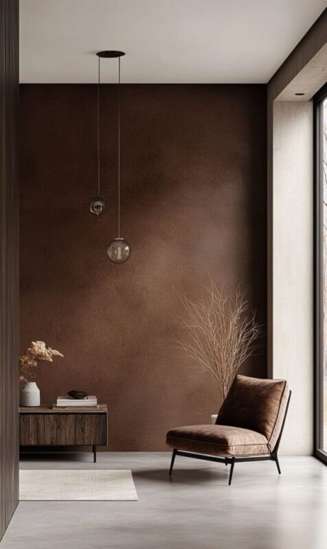
1. Espresso Brown as the New Neutral

Espresso brown is emerging as a sophisticated alternative to white and grey. It grounds a room instantly, creating a sense of calm and richness that lighter shades often lack. Unlike stark neutrals, it brings warmth without feeling overly decorative. When paired with soft lighting and natural materials, it creates a cocoon-like atmosphere that feels both modern and timeless. This shade works particularly well in living rooms and bedrooms where comfort and depth are key.
2. Smoky Jade for a Calm, Collected Look

Smoky jade sits perfectly between green and grey, making it incredibly versatile. It has enough color to feel intentional but remains muted enough to function like a neutral. This balance allows it to work across different rooms without overwhelming the space. It’s especially effective in areas where you want a calming, collected atmosphere, such as bedrooms or home offices.
3. Terracotta That Works in Every Room

Terracotta has become one of the most adaptable colors in modern interiors. Its warmth makes spaces feel inviting, while its earthy undertones keep it grounded. Unlike brighter oranges, terracotta feels natural and easy to live with. It works in living rooms, kitchens, and even bathrooms, adding depth without overpowering the design.
4. Olive Green That Feels Refined

Olive green is being redefined in softer, more sophisticated tones that feel calm rather than heavy. Instead of bright or overly saturated shades, designers are leaning toward versions with grey or brown undertones, which give the color a more natural and elevated feel. This makes it easier to live with while still adding depth to a space. Olive pairs beautifully with wood, stone, and warm metallic accents, creating a balanced environment that feels grounded, modern, and quietly refined without being too bold.
5. Smoky Taupe Walls

Smoky taupe is emerging as a refined alternative to both stark white and cool gray walls. It sits quietly between beige and gray, but with a warmer, more grounded undertone that feels softer and more livable. Unlike flat neutrals, smoky taupe adapts beautifully to changing light, appearing lighter during the day and deeper, more enveloping in the evening. This makes it ideal for whole-home use, especially in living rooms and bedrooms where comfort matters most. It brings subtle depth without demanding attention, creating spaces that feel calm, cohesive, and thoughtfully designed rather than plain.
6. Moody Dining Rooms That Feel Intimate

Dining rooms are becoming one of the most popular places to experiment with deeper, moodier colors. Instead of bright, open spaces, designers are embracing tones that create a sense of intimacy and focus. Darker walls naturally bring people closer together, making conversations feel more personal and engaging. When paired with warm, layered lighting, the entire room takes on a softer, more inviting glow. This shift transforms dining from a purely functional activity into an experience that feels intentional, relaxed, and memorable.
7. Painted Interior Doors for Contrast

Interior doors are no longer being ignored,they’re becoming a subtle design opportunity. Painting them in a slightly darker or contrasting tone introduces depth without overwhelming the space. It breaks up large areas of wall color and adds a layer of visual interest that feels thoughtful rather than dramatic. This approach works especially well in homes transitioning away from all-white interiors, offering a low-commitment way to introduce color. It’s a small change, but one that makes the overall space feel more designed and cohesive.
8. Color-Drenched Ceilings That Add Depth

Ceilings are no longer left white by default, and this small shift is making a big impact. Painting the ceiling the same color as the walls creates a seamless, enveloping effect that softens the edges of a room. Instead of stopping your eye at a sharp contrast, the color flows continuously, making the space feel more cohesive and intentional. This technique works especially well with deeper tones, adding drama without feeling overwhelming. It’s a subtle but powerful way to transform how a room is perceived.
9. Muted Mustard Tones That Add Subtle Energy

Muted mustard tones are becoming a quiet favorite for adding warmth without overwhelming a space. Unlike bright yellows, these deeper, slightly earthy versions feel grounded and sophisticated. They reflect light in a way that keeps rooms feeling warm while still offering personality. Used in living areas or hallways, mustard tones can act as a bridge between neutral and expressive, making them a strong alternative to plain white walls.
10. Dusty Blues Instead of Crisp Whites

Dusty blues are emerging as a softer alternative to stark white walls. Their muted, slightly grey undertones allow them to act almost like a neutral while still introducing gentle color. Unlike brighter blues, they don’t feel cold or overpowering. Instead, they create a calm, relaxed backdrop that works especially well in bedrooms, reading areas, and quiet spaces. This shade brings just enough variation to make a room feel thoughtful, while still maintaining the lightness and simplicity many people love about neutral interiors.
11. Muted Plum Tones for Unexpected Depth

Muted plum tones are an unexpected but increasingly popular choice. These shades bring depth and richness without feeling overly dramatic. When softened with gray undertones, plum becomes a sophisticated neutral rather than a bold statement. It works particularly well in bedrooms and dining spaces where a slightly moody atmosphere is desired.
12. Oxblood Red That Feels Deep

Oxblood red is emerging as a bold yet surprisingly livable alternative to white walls. Unlike brighter reds, this deep, wine-toned shade feels grounded and sophisticated rather than overwhelming. It works particularly well in dining rooms, libraries, or bedrooms where a slightly moody atmosphere enhances the space. When paired with warm lighting and natural materials, oxblood creates depth and richness without feeling heavy. It’s a color that brings personality into a room while still maintaining a refined, designer-approved look.
13. Celery Green That Feels Fresh

Celery green brings a lighter, fresher take on green walls without leaning too bright or playful. It sits comfortably between neutral and color, offering a soft vibrancy that feels natural rather than decorative. This shade works particularly well in kitchens, sunrooms, or casual living areas where a sense of freshness is welcome. When paired with wood and soft textiles, celery green creates a relaxed environment that feels both modern and approachable.
14. Soft Limewash Walls

Limewash is becoming one of the most compelling alternatives to plain white walls because it introduces both color and movement at the same time. Unlike flat paint, it creates a soft, layered effect where tones shift gently depending on the light. This makes even neutral shades feel more dynamic and lived-in. Designers are using limewash in warm beiges, soft clays, and muted grays to create spaces that feel calm but never flat. It’s not just a color choice,it’s a way to make walls feel more natural and visually engaging.
15. Deep Charcoal for Contrast

Deep charcoal is one of the easiest ways to introduce contrast without committing to full black. It has enough softness to feel livable, yet enough depth to dramatically shift how a room feels. Unlike lighter greys, charcoal adds weight and definition, making furniture and decor stand out more clearly. It works especially well in living rooms, bedrooms, or even home offices where you want a slightly moody, grounded atmosphere.
16. Blush Tones That Feel Mature

Blush tones have evolved far beyond their earlier, overly sweet versions. Today’s blush shades are muted, dusty, and grounded with warm undertones that make them feel refined rather than delicate. They act almost like a neutral, adding softness without overwhelming the space. Blush works beautifully in bedrooms, living rooms, and even dining areas when paired with wood, stone, or deeper colors. The result is a room that feels warm, balanced, and quietly elegant without leaning too feminine or overly styled.
17. Harbor Haze Blue That Feel Calm

Harbor haze blue offers a softer alternative to traditional blues, bringing in color without overwhelming the space. With its subtle gray undertone, it feels muted and atmospheric rather than bright or coastal. This makes it ideal for bedrooms, offices, or quiet living spaces where a calm mood is important. It reflects light gently, creating a soft glow throughout the day. Compared to white walls, it adds personality while still maintaining a sense of openness and ease.
18. Dual-Toned Neutrals

Instead of relying on a single neutral color, designers are layering two complementary tones within the same space. This could mean pairing a soft beige with a slightly deeper taupe, or using subtle variations of the same color across walls and trim. The result is a room that feels more dimensional without introducing bold contrast. This approach moves away from flat white walls and creates a more thoughtful, layered environment that feels intentional and refined.
Wrap Up
The move away from all-white walls isn’t about abandoning simplicity, it’s about adding warmth, depth, and intention. Today’s interiors feel more personal because they use color in subtle, elevated ways that enhance how a space is experienced every day. Even small changes, like shifting to a richer neutral or experimenting with one room, can transform the entire mood of your home. For more inspiration and real-home ideas, explore Home Designing, where thoughtful color, materials, and modern living come together beautifully.


