How to Use Different Colour Wallpaper to Define Your Interior Style
Have you ever stood in front of a wallpaper sample book and felt completely overwhelmed?
You’re not alone. With so many colours, patterns and textures available, it’s easy to fall into the trap of choosing what’s trending instead of what’s truly right for your space. But here’s the truth: wallpaper isn’t just decorative, it’s directional. The colours you choose have the power to define your interior style, reflect your personality, and set the emotional tone of your home.
Right now, there’s a shift happening. Homeowners are moving away from generic minimalism and starting to use wallpaper as a personal design statement. The real question is: which colour is best for wallpaper when you want to create a space that feels both intentional and inspiring?

The Trap: Playing It Safe
Somewhere along the way, we were told to play it safe with walls. Stick to beige, white or grey, maybe throw in a “feature wall” if we’re feeling bold. This mindset has kept us stuck in a loop of neutral sameness. Even now, many people hesitate to use colourful wallpaper because they’re afraid of making a mistake. “What if it’s too loud?” “What if I get tired of it?” “What if it doesn’t match my furniture?”
The irony? Avoiding colour often leads to interiors that feel soulless. Think of all the rooms you’ve seen that are technically ‘nice’ but completely forgettable. The fear of getting it wrong has paralysed creativity. But what if the problem isn’t the wallpaper, it’s the story we’ve been telling ourselves about colour?
Remember, design cohesion comes from understanding mood and purpose, not just tones on a chart. Colour isn’t just a finishing touch; it’s foundational.
And the great news?
Playing with bolder shades doesn’t mean sacrificing elegance and colour can introduce depth and drama when used strategically, especially in rooms like dining areas, offices or even hallways.
The Reframe: Wallpaper as a Style Compass
Here’s a different way to think about it: your wallpaper colour should lead your interior design, not lag behind it. It’s not an afterthought or a filler, it’s a style anchor. And once you choose a direction, everything else (furniture, accessories, lighting) can fall into place with ease.
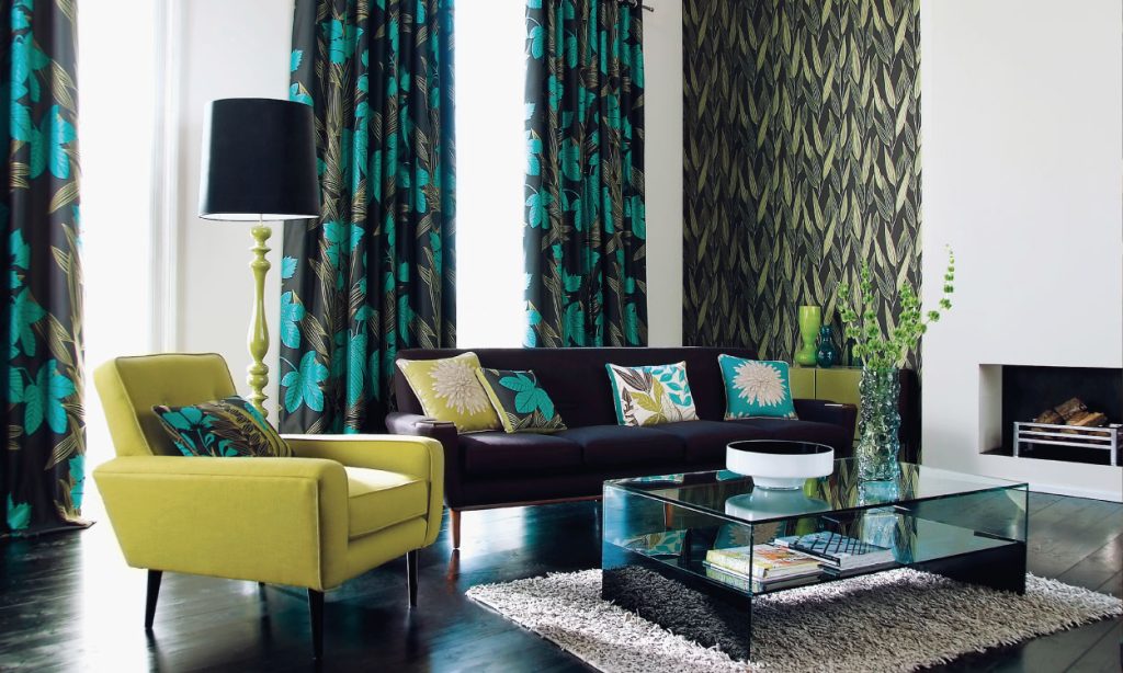
Let’s break it down. Looking to create a sense of calm and elegance? Consider soft greens, dusky blues, or warm taupes. These hues signal balance and tranquillity. Want a bold, maximalist vibe? Jewel tones like emerald, sapphire or terracotta work beautifully, especially in dark colour wallpaper, which adds richness and intimacy to larger rooms or spaces you want to feel cocooning.
Prefer something playful yet polished? Pink and white wallpaper is having a moment, it’s not just for nurseries anymore. In fact, this combination can bring a crisp, modern softness to spaces like kitchens, bathrooms or feminine home offices. It balances freshness with charm, offering a great alternative to plain neutrals.
So, which colour is best for wallpaper? It depends on your vision but the answer should always start with the feeling you want to evoke.
Matching Mood with Meaning
Wallpaper isn’t just visual, it’s emotional. Colour shapes how we feel in a room. That’s why choosing the right tone for the right space matters so much. Think soft blush for tranquillity, sage green for groundedness, mustard for energy or navy for sophistication.
Bedrooms benefit from restful shades such as muted blues, earthy taupes, even lavender. In social areas like living rooms or dining spaces, richer tones encourage intimacy and storytelling. For smaller spaces like cloakrooms or nooks, that’s your chance to experiment without overwhelming the senses.
Remember, colour interplay between walls, wallpaper and trim can elevate a room’s atmosphere. It’s not about matchy-matchy, it’s about emotional coherence. You want the space to feel like it belongs to the people living in it.
Making the best colour for wallpaper the one that reflects how you want to feel every time you walk into that room.
Next-Level Insight: Your Home, Your Narrative
Here’s something rarely discussed: your wallpaper doesn’t just decorate your home, it tells your story. A moss green botanical print might signal your love of nature, a geometric blush and white design might hint at your quiet confidence whilst a vintage damask in deep navy might evoke your sense of history and drama.
Wallpaper gives you a chance to speak without words. And when you use colour as a storytelling tool, it transcends trends. You don’t need to overhaul your entire home to make a statement. Start with a hallway, reading nook or alcove and see how much of a shift a simple wall can create.
Conclusion: Choose with Purpose
Ultimately, which colour is best for wallpaper isn’t about trends, it’s about truth. It’s about who you are and how you want your home to feel. Don’t be afraid to move beyond the safe choices. Use wallpaper as a tool to define your style and express your identity with clarity. Your walls shouldn’t blend in, they should speak up.
The post How to Use Different Colour Wallpaper to Define Your Interior Style appeared first on UK Home Improvement.