The Color Drenching Room: 18 Ways to Go All-In on One Color (Without Losing Your Mind)
Color drenching, painting walls, ceiling, trim, and sometimes even doors in a single color, is quickly becoming one of the defining interior design techniques of the moment. Instead of relying on contrast between walls and architectural details, this approach embraces total immersion in a single hue. The result can feel calm, dramatic, cocooning, or surprisingly modern depending on how it’s executed. But going all-in on one color can feel intimidating. Will the room look overwhelming? Will the space feel smaller? What happens if the color goes wrong? The key to successful color drenching isn’t just choosing a bold shade, it’s understanding how color interacts with lighting, furniture, texture, and scale. The following design ideas explore practical ways to embrace the trend while keeping your space balanced and livable.
1. Paint Walls, Ceiling, and Trim the Same Shade

The defining feature of color drenching is painting every architectural surface in the same hue. When walls, ceiling, and trim share one color, the usual visual boundaries disappear and the room feels more unified. Instead of highlighting edges and moldings, the color wraps the entire space in a single atmosphere. This approach can make a room feel unexpectedly calm because the eye isn’t jumping between contrasting surfaces. It also allows furniture and art to stand out more clearly. For best results, choose a paint finish that works across surfaces, often matte or eggshell for walls and satin for trim.
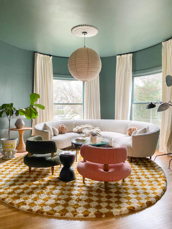
2. Experiment With Soft or Light Color Drenching

Neutral palettes are one of the easiest ways to experiment with color drenching without overwhelming a space. Shades like warm beige, taupe, soft clay, and pale greige can be applied to walls, ceilings, and trim to create a serene, cohesive environment. These tones work particularly well in bedrooms, living rooms, and home offices where a calm atmosphere is important. Because neutrals reflect light gently, they keep the room feeling open and comfortable even when the entire space is painted in one shade.
3. Try the Half-Commitment Version

If painting an entire room one color feels intimidating, start with a partial version of the technique. Paint the walls and trim in the same shade while leaving the ceiling slightly lighter. This still creates a cohesive look but reduces the intensity of full color drenching. Many homeowners use this approach as a stepping stone before committing to painting every surface in the room.
4. Small Rooms Are Surprisingly Perfect for It

Room size influences how color drenching feels. In small rooms, deep tones can create a cozy, cocoon-like effect that feels intimate rather than cramped. Powder rooms and small bedrooms often benefit from this approach. Larger rooms, on the other hand, may need more texture and furniture variation to prevent the color from feeling too expansive. Understanding the scale of the room helps determine whether the palette should lean darker, softer, or more textured.
5. Use Furniture Contrast to Balance

When an entire room is painted in one color, furniture becomes an important way to create visual balance. Pieces in lighter tones,such as cream upholstery, natural wood, or soft linen,can stand out beautifully against saturated walls. This contrast prevents the room from feeling flat or overwhelming. Alternatively, darker furniture can anchor lighter monochrome spaces. The key is to intentionally choose furniture that either highlights or complements the dominant color. When done thoughtfully, contrasting furniture gives the eye places to rest while still maintaining the immersive effect of color drenching.
6. Use Rich Earth Tones for Warm, Dramatic Spaces

Rich earth tones are some of the most popular colors for color drenching because they create depth and warmth. Shades such as terracotta, olive green, espresso brown, and deep rust feel grounding and sophisticated when used across walls, ceilings, and trim. These palettes work especially well in living rooms, dining rooms, and reading spaces where a cozy atmosphere is welcome. The natural warmth of these tones helps the room feel inviting rather than heavy, even when the color surrounds the entire space.
7. Understand Undertones Before You Commit

Undertones matter more in color drenching than in standard paint schemes because the color appears on every surface. A green with blue undertones may feel cool and modern, while one with yellow undertones can feel warm and earthy. Always test paint samples on several walls and observe them throughout the day. Lighting changes can dramatically alter how the color appears in the space.
8. Know Which Colors Don’t Work Well

Not every color translates well to color drenching. Extremely bright or highly saturated shades such as neon yellow, intense red, or vivid orange can become visually overwhelming when applied to every surface. These colors reflect light strongly and may feel exhausting over time. If you prefer vibrant hues, choosing slightly muted or deeper versions will create a more balanced result while still keeping the bold personality of the color.
9. Introduce Small Moments of Contrast

Even in a color-drenched room, a few subtle contrasts can make the design feel more dynamic. Small details such as black picture frames, metallic lamps, patterned cushions, or natural wood accessories can break up large areas of color. These accents should remain minimal so the room still reads as monochromatic. Think of them as visual punctuation that adds interest without distracting from the overall palette. When carefully placed, these touches create balance while allowing the dominant color to remain the star of the space.
10. Add Texture to Color-Drenched Walls

When a room relies on a single color, wall texture becomes a powerful design tool. Finishes such as limewash, plaster, or textured paint can add depth without introducing additional colors. These surfaces reflect light differently throughout the day, creating subtle variations that keep the room visually interesting. Even wallpaper with a tone-on-tone pattern can achieve a similar effect. Texture ensures that a color-drenched room feels
11. Allow for Natural Light

Natural light plays an important role in how a color-drenched room feels throughout the day. Large windows, sheer curtains, or reflective surfaces allow daylight to soften deep tones and reveal subtle undertones in the paint. Without enough natural light, strong colors may appear heavier or darker than intended. Allowing sunlight to interact with the walls and ceiling keeps the space feeling balanced and prevents the monochromatic palette from becoming visually overwhelming.
12. Paint the Ceiling for a True Drenching Effect

Painting the ceiling the same color as the walls is one of the defining elements of color drenching. Instead of creating a visual break, the ceiling becomes part of the overall atmosphere of the room. This technique softens the edges where walls meet overhead surfaces and makes the space feel more immersive. In many cases, matching the ceiling color can even make the room feel taller because the eye moves smoothly across surfaces.
13. Add Art to Break the Monotony

Artwork is an easy way to add visual interest to a monochromatic space. Large paintings, framed prints, or sculptural wall pieces introduce contrast without disrupting the overall color scheme. Light canvases or dark frames can stand out beautifully against saturated walls. Art also draws the eye around the room, preventing the color from feeling flat while still maintaining the cohesive look that defines color drenching.
14. Use Natural Materials for Balance

Natural materials help soften the intensity of a color-drenched room. Elements such as wooden furniture, woven rugs, stone surfaces, or linen fabrics introduce warmth and texture that balance strong paint colors. These materials also bring an organic quality to the space, making it feel more comfortable and lived-in. By mixing natural textures with a monochromatic palette, the room gains depth while still preserving the immersive effect of the color.
15. Incorporate Monochrome Accessories

Accessories in similar shades help reinforce the color-drenched aesthetic. Decorative objects such as vases, cushions, books, and ceramics in slightly different tones of the same color create subtle layers within the space. These pieces maintain the monochrome palette while preventing the room from feeling too uniform. When styled thoughtfully, monochrome accessories add richness and personality without introducing competing colors.
16. Use the Bathroom as a Testing Ground

Bathrooms are ideal spaces for experimenting with bold design techniques like color drenching. Because these rooms are usually smaller and separate from main living areas, dramatic colors feel exciting rather than overwhelming. Painting the walls, ceiling, and trim the same shade can instantly transform a simple bathroom into a memorable design statement.
17. Don’t Be Afraid of Dark Colors

Dark colors often work surprisingly well in color-drenched spaces. When walls and ceilings share the same shade, the boundaries between surfaces soften. This can actually make the room feel larger and more atmospheric rather than smaller. Deep greens, navy blues, and charcoal shades create cozy environments that feel sophisticated and enveloping.
18. Try Color Drenching With Wallpaper

Color drenching doesn’t always have to rely on paint. Wallpaper can achieve the same immersive effect while adding subtle pattern and texture to the room. Tone-on-tone wallpaper—where the pattern stays within the same color family, creates visual interest without breaking the monochromatic look. Pairing wallpapered walls with ceilings and trim painted in a matching shade helps maintain the drenching effect. This approach is especially effective in bedrooms, dining rooms, or powder rooms where you want a dramatic yet refined atmosphere. The pattern adds depth while the consistent color palette keeps the space calm, cohesive, and visually sophisticated.
Finishing Notes
Color drenching proves that a single color can completely transform how a room feels. When used thoughtfully, balancing lighting, texture, furniture, and undertones, it creates spaces that are immersive, sophisticated, and surprisingly calming. Whether you experiment in a powder room or commit to a living space, the key is choosing shades that suit the mood of the room and layering materials that keep the design visually rich. For readers of Home Designing, color drenching offers an exciting way to explore bold interiors while maintaining harmony, proving that sometimes the most powerful palette is simply one beautiful color used well.