Texas Tech’s new logo draws mixed reactions
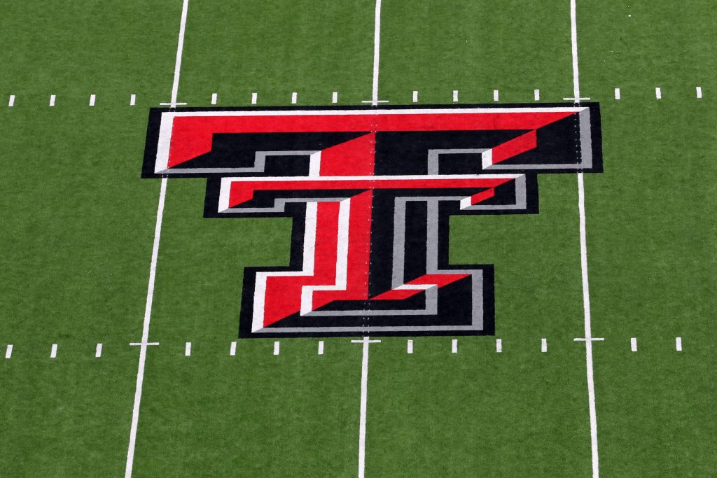
The university released a plethora of new logos on Tuesday, Oct. 7 that will be used beginning in spring 2026. Most notably, Texas Tech’s primary ‘double T’ logo has a new look. The current iteration is beveled with red, white and black on it to give it a 3D look. The ‘modernized’ one released is rather flat with red and white, similar to the school’s old look used through the 20th century.
‘The clean, flat design of the new Double T logo combines many of the traditional aspects of the Texas Tech’s primary mark with a modernized twist that features proportional design elements and updated colorways,’ the university said in a statement.
Other logos introduced include a new Red Raider look, updated ‘guns up’ logo and Raider Red-sports specific marks.
The updated logos come after Texas Tech said it did a brand audit done with creative agency LDWW, located in the Dallas-Fort Worth area, as well as Adidas. It plans to introduce a new branding and style guide in spring.
Reaction to Texas Tech new logo
Normally, people applaud when teams or universities embrace tradition and retro looks. While that’s what the Red Raiders did, not everyone on social media loved the new look Texas Tech will go with. People noted it doesn’t look modern and seems rather plain compared to what it currently has.
However, not all reactions were bad, with some people loving the design, as well as the secondary logos that feature the Red Raider and the Texas state outline. The retro look was also something fans had been wanting for some time, so it seems the people that really care about Texas Tech are happy.